


overview
Challenge
RESULTS
A Crafted Signature
Drawing from the theatre’s 1930s heritage, the custom “P” pays homage to the original Paramount mark, echoing its era without recreating it.
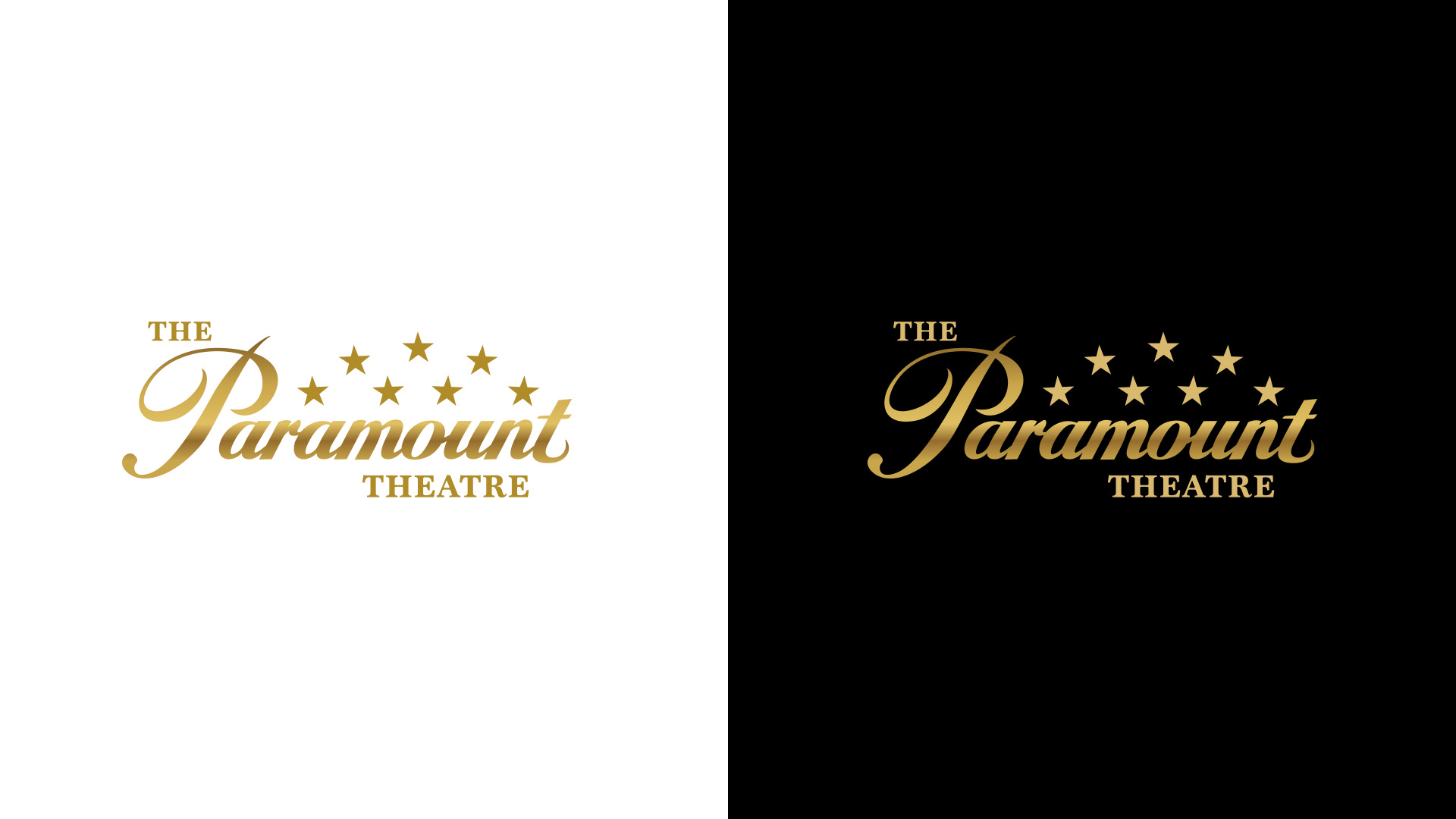
The stars were reoriented to arc upward, a subtle nod to the theatre’s iconic starlit ceiling. Gold, drawn from the building’s gilded detailing, reinforces a sense of permanence and premium experience. Every element serves a purpose — from the upward movement of the stars to the distinctive loop of the “t.”
Because the gold finish was central to the identity, two optimized versions of the mark were developed for light and dark backgrounds, ensuring the richness of the logo in every application.
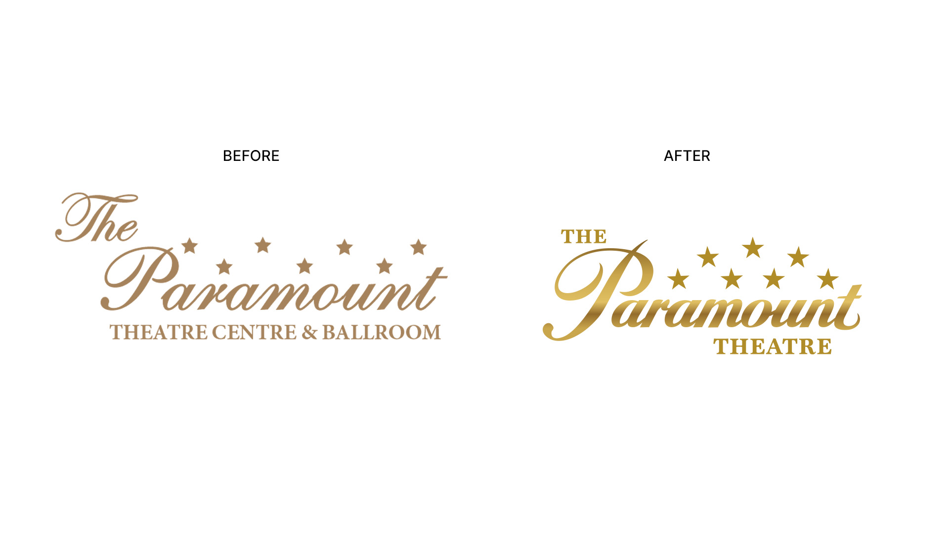
“Paramount Theatre Centre & Ballroom” was streamlined to The Paramount Theatre, reinforcing focus and memorability. A formal usage standard was established: the name is always written as The Paramount Theatre — capitalizing “The” as part of the official mark.
One Name. One Identity.
The identity refresh also simplified the organization’s public name. “Paramount Theatre Centre & Ballroom” was streamlined to The Paramount Theatre, reinforcing focus and memorability. A formal usage standard was established: the name is always written as The Paramount Theatre — capitalizing “The” as part of the official mark. The adjustment strengthens consistency across communications while preserving equity.
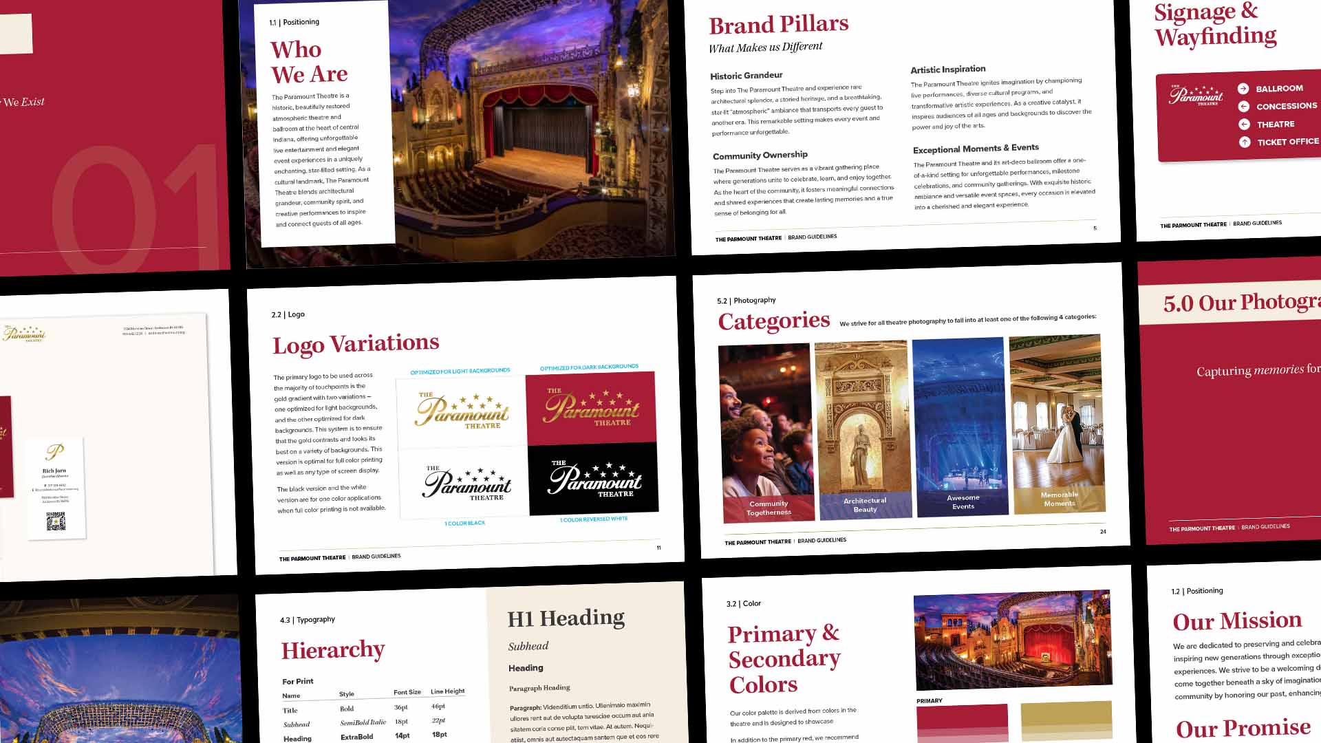
A comprehensive brand guide codifies the identity across voice, color, typography, photography, and application standards. The palette draws directly from the theatre’s architecture, and the typography balances heritage and clarity through a pairing of classic serif and a modern sans. The result is a system designed for consistency, flexibility, and longevity.
A System Rooted in Four Pillars
To guide expression across messaging and visuals, the identity was grounded in four core pillars: Historic Grandeur, Community Ownership, Artistic Inspiration, and Exceptional Moments. Each represents a distinct dimension of the theatre’s role — history, belonging, performance, and memories.
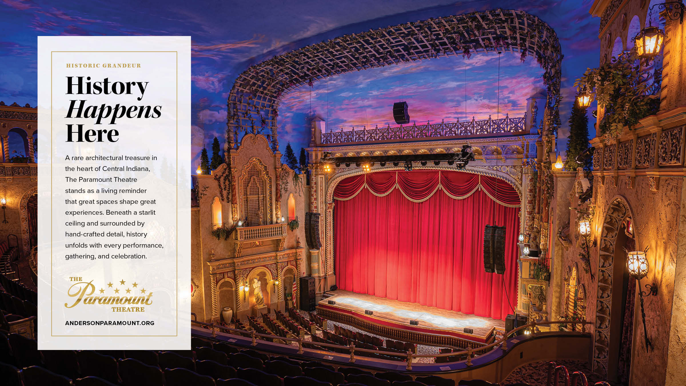
Historic Grandeur
The architecture leads, and the identity reflects it. Every application honors the craftsmanship and beauty of the space.

Community Ownership
The theatre belongs to the community it serves. Messaging centers on shared experience and unity, rather than promotion.
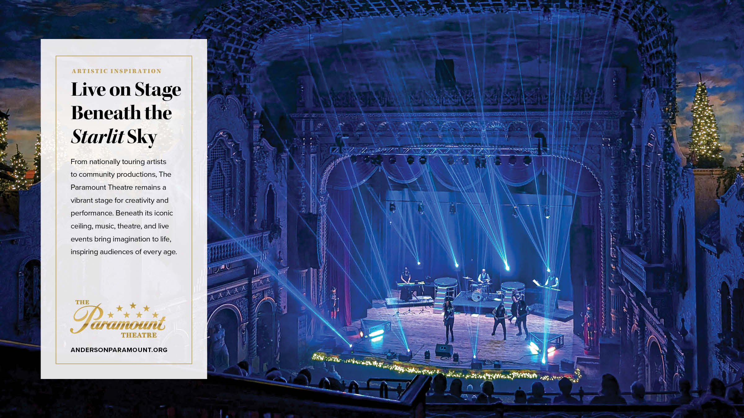
Artistic Inspiration
Touring acts and local productions take visual priority, supported by a consistent Paramount signature.
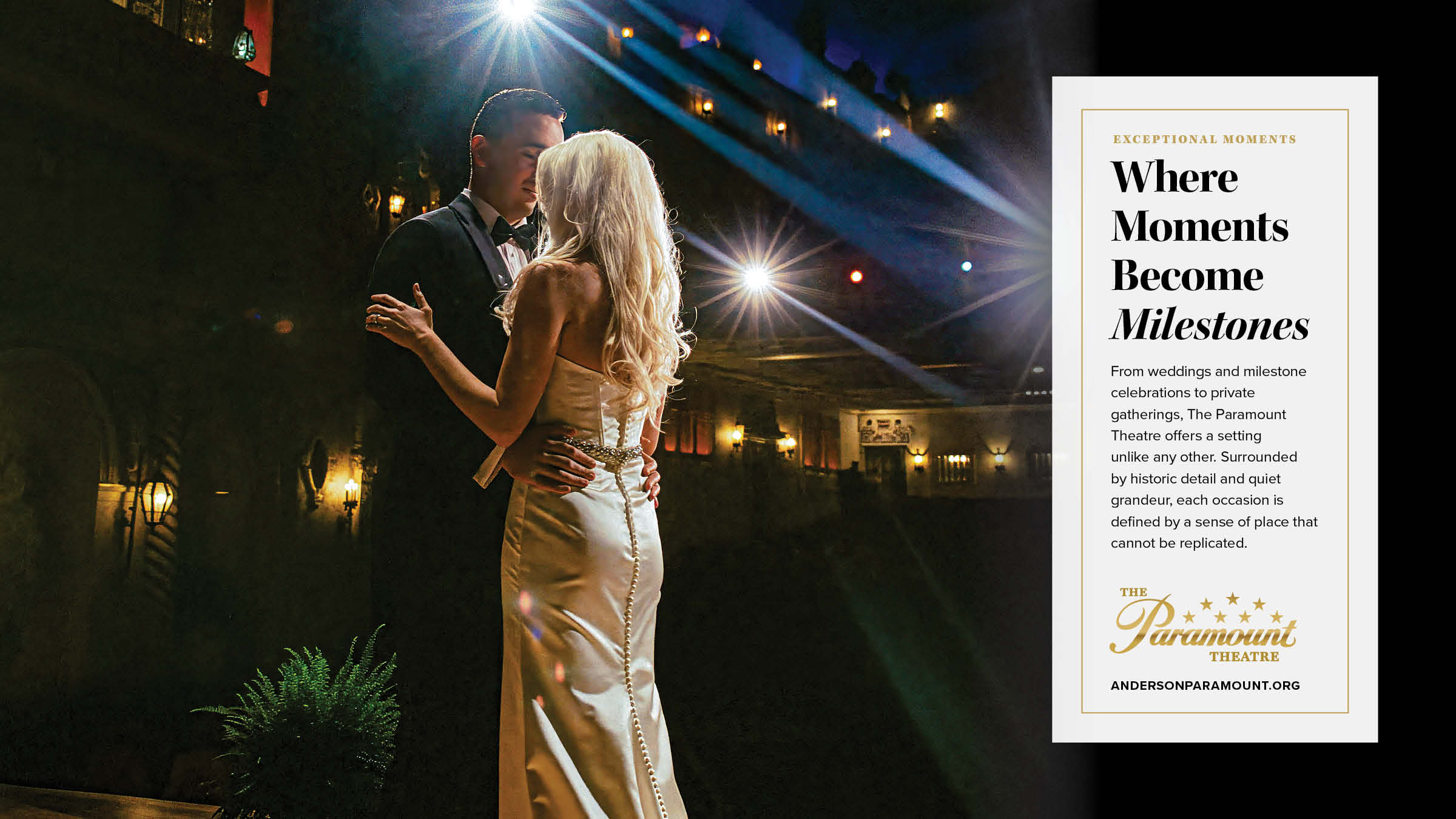
Exceptional Moments
Private events and celebrations are elevated by rich history and unique decor, positioning the theatre as a setting worthy of life’s milestones.
Promotional System in Practice
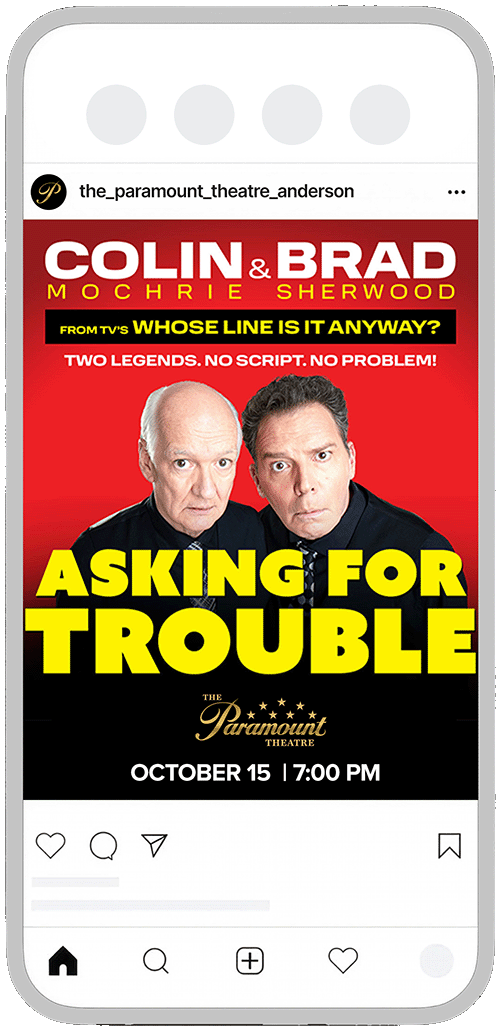
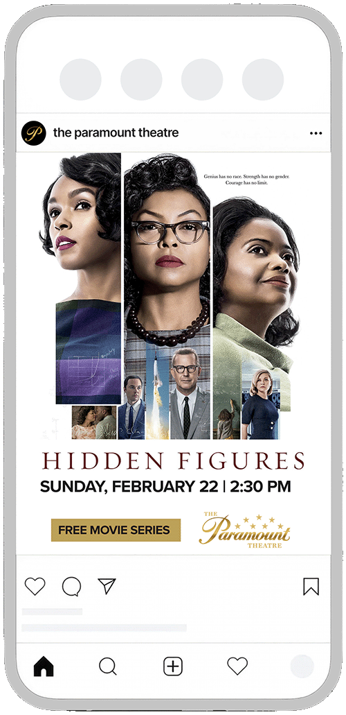
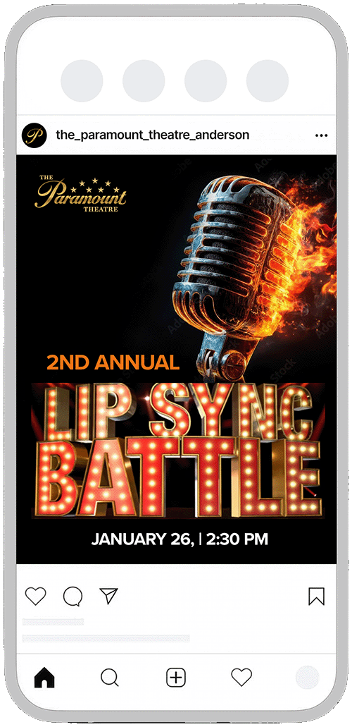
A disciplined identity must perform in real-world promotion. The system was designed to flex across posters, digital platforms, and co-branded tour artwork without losing clarity or authority. Show branding leads where appropriate; the Paramount signature anchors every piece through consistent placement, scale, and hierarchy. Whether promoting nationally recognized performers, free community programming, or in-house events, the venue remains visually cohesive and unmistakable.
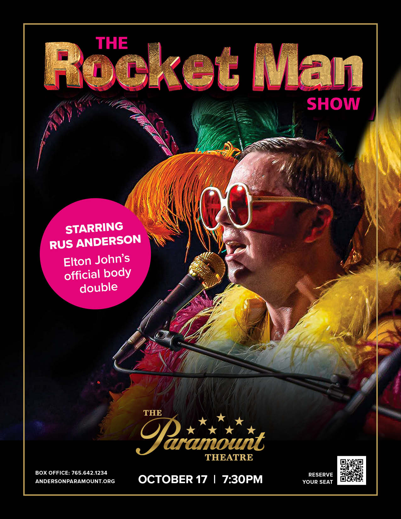
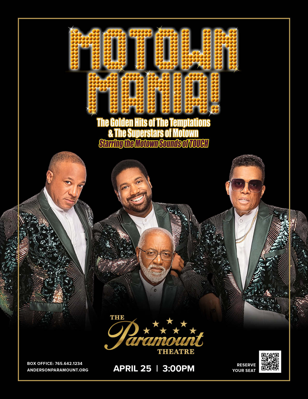
Digital Adaptation
The identity scales seamlessly into mobile-first formats. Social media applications maintain the same structural discipline — clear hierarchy, restrained use of gold, and consistent signature placement. Every post feels connected to the broader brand system, so the theatre’s presence remains steady, regardless of genre or format.
Merchandise & Touchpoints
Select branded items extend the identity beyond the stage. Every touchpoint reflects disciplined thinking designed to build trust.